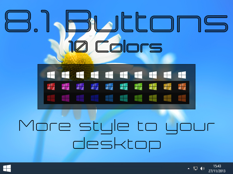
Hi all. I created new buttons to Start8, and would welcome criticism of you so I can improve my work. Thank you for your attention!(Brazilian Portuguese translated by Google)
https://www.wincustomize.com/users/5747081/JoeyW8
Personally I'd make them less flat. I know flat is in like Metro but they lack depth. Just my opinion. Looks good though.
interesting and nice looking. I'll give you a pat on the back.
Sign Up or Login and this ad disappears! There are many great features available to you once you register. Sign Up for a free account and browse the forums without ads.
Hahaha... thank you
Feedback is:
- !
That's cool! 'm Now sixth in the Top Start8 Buttons Skinners... .
2
I am very happy to now be in fourth place. It motivates me to do more buttons. Thank you to those who have made the download. My goal is to get to second place. Thanks!
There are many great features available to you once you register, including:
Sign in or Create Account