Ever since I started using a tabletPC I've wanted a Wacom tablet. The PC I have is nice enough but the screen is too small and it wasn't designed for art work. It can get the job done, but it's just not there.
But now . . .I just don't know. I worry about direction and goals when i see things like this.
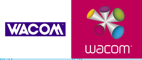
"Wacom, the Japanese
company responsible for the addictive tablets — try to pry one from any
designer and you will suffer the consequences — unveiled a new identity
and brand positioning last week, aimed at making headway into the
general consumer market while maintaining its attention on the
professional, hardcore user.
The new company motto, "Open Up. Sense
More." — both technological and slightly kinky — is intended to lead
the way in the new appreciation of this company, while their latest
tablet design,
Bamboo,
hopes to cash in on the more general public willing to put their mouse,
and carpal tunnel syndrome, behind them.
The old logo — with its
mid-80s corporate design sensibility — has been replaced with a
monoweight, mid-00s techie sensibility. (Do note the legacy of using
the same shape, though inverted, for the
W and
M). The identity has been designed by Wolff Olins, them of
London 2012 fame and of bright-color propensity (evident throughout the new Wacom web site). While
the revised wordmark is a considerable improvement, the introduction of
The Color Thing, all bouncy and weird, is a detriment to an otherwise simple evolution" [
more]
What do you think of Wacom tablets and their new logo?
