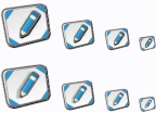
small icons are tricky. It might be a good idea to simplify the original image for the small version. Another thing that could help with the edges is a drop shadow effect. And finally, a resampling algorithm that respect gamma correction would give you better results.

This image demonstrates some of these techniques, but the quality is not 100%, cause it was only based on the small image above.
One more thing - use the entire 16x16 space, do not waste those precious pixels

.
--->
RealWorld Icon Editor can help you with many of these tricks.

